
Money tracker – Fynza
My first iOS project: design, development, and App Store release with a marketer.
Outsourcing project for a Swedish company. Building climate control system. Equipment connects to the app and sends data for analysis and balancing.
The task was to rethink old mobile and web solutions and bring them into one product. Build separate interfaces for phone and tablet. Account for multibranding and different usage scenarios.

Requirements for the new version were set in advance. The client left room for design decisions and improvements. I started by analyzing the old version. Went through the main scenarios, saw where the interface slows work and where logic can be simplified. That gave a base for rethinking, not just a redesign on top of the old solution.

User opens the app. Sees available equipment. Connects it and goes to configuration. The scenario is simple and repeats most often — so it became the basis for the whole interface.
Next — configuring flows. There are several types. The task is to choose a reference configuration to compare data against. Important not to overload the user but still give control.
After configuration, data appears. Charts and logs show the gap between sensor readings and reference values. That shows at once whether everything works correctly and if there’s energy waste.
We started with Flex 2 — a simplified version of the product. The task wasn’t to cover all scenarios, but to find the foundation and settle on a visual direction. Built key screens and basic navigation. Checked how the interface behaves in real scenarios. Saw what works and what needs rebuilding. This version became the anchor for later decisions and helped avoid rework at later stages.

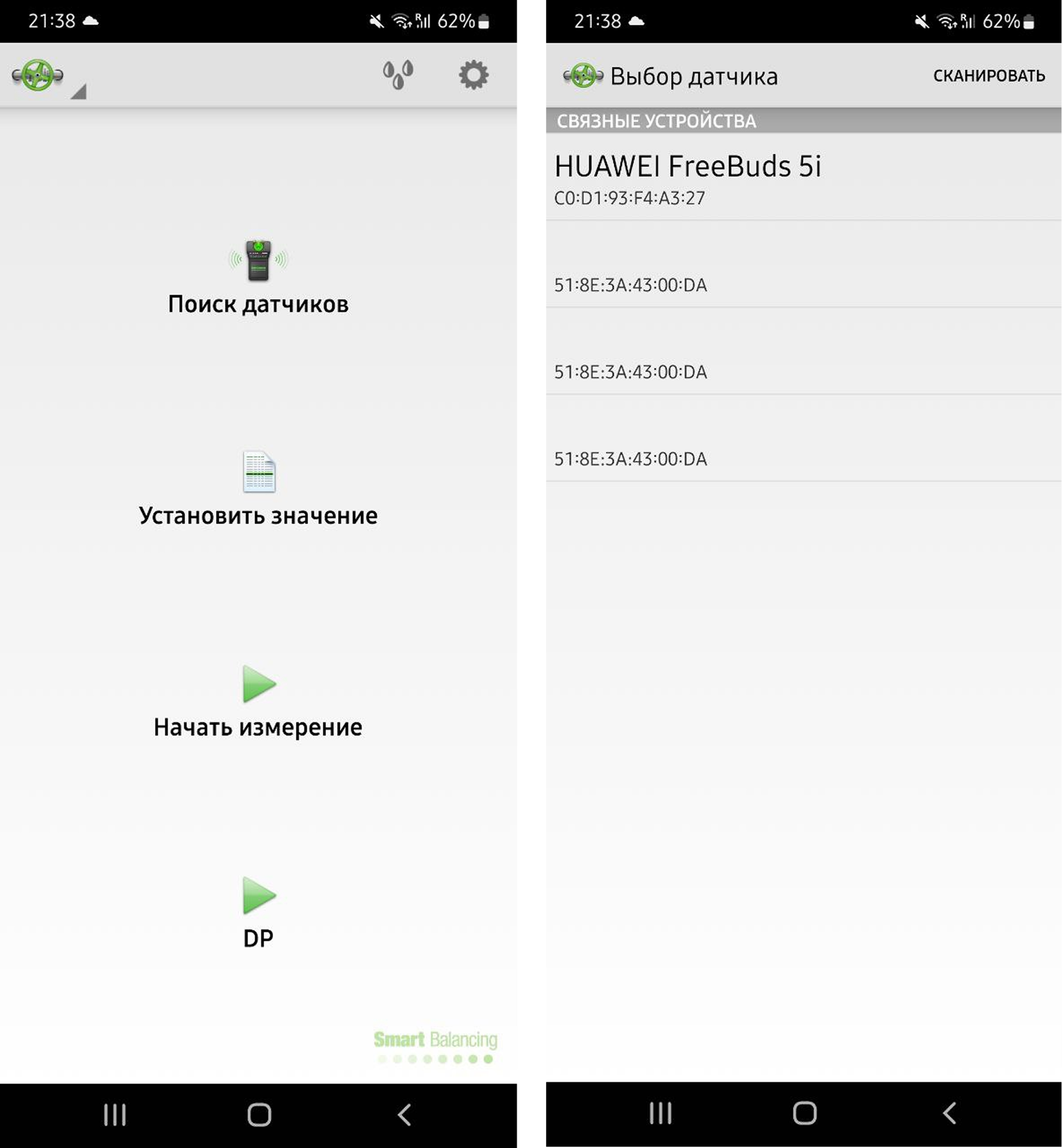
Made the first screen as simple as possible. A large search button sets the main scenario. From there, jump to sensor configuration. Added a status bar for connection state. It barely takes space but keeps you informed about the sensor. Useful info always in view, no extra actions.
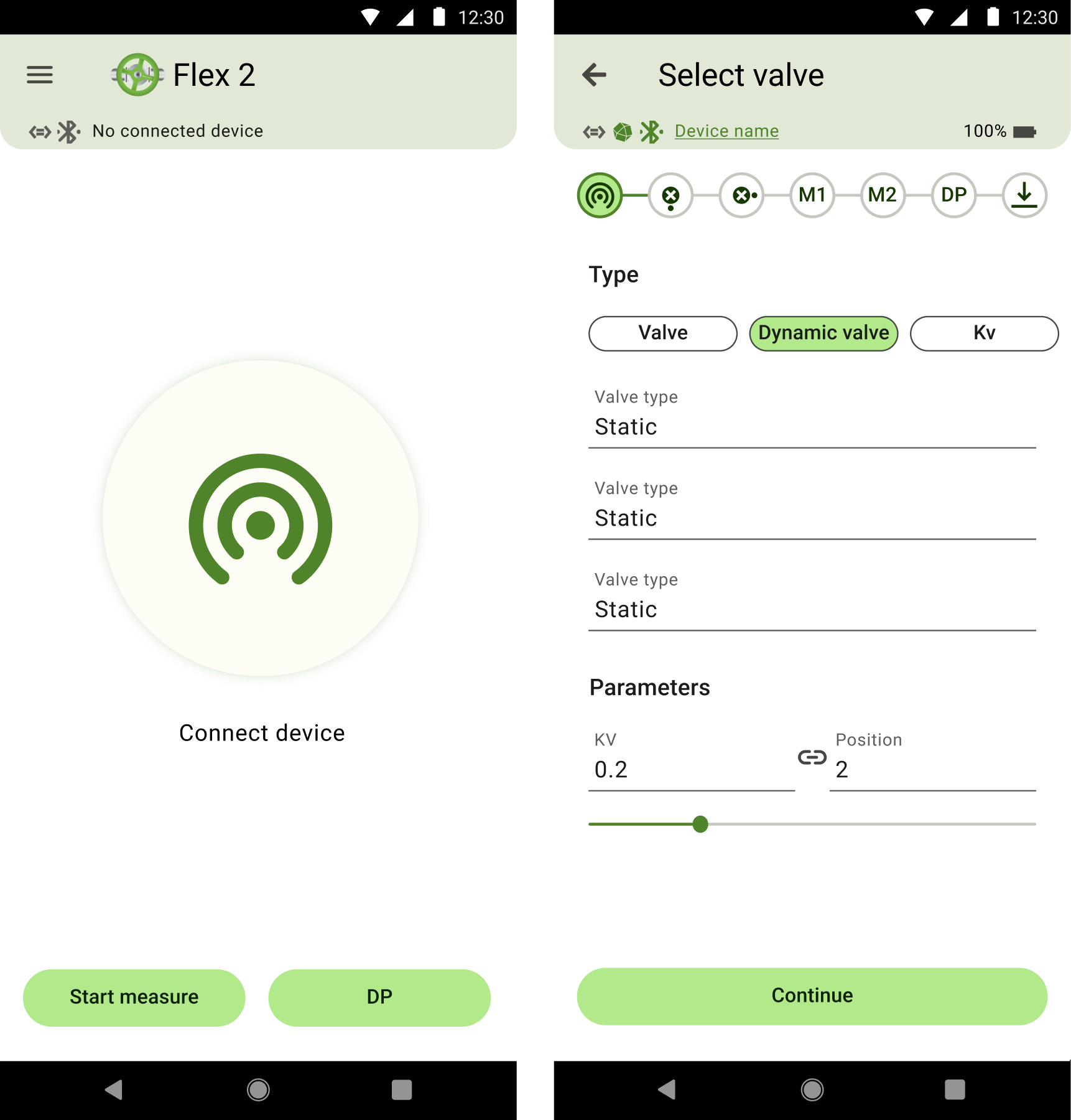
Used a stepper and chips for type selection. After review we removed one-off actions like “open / close valve” and kept only core steps. Moved the chart to the bottom panel. That simplified the screen and made the scenario clearer. The solution relied on modern patterns and real user behavior.
Not all ideas worked the first time. Had to drop actions via the bottom panel — users found it awkward. Ended up keeping popups. Kept chips for navigation. This set of screens was enough to settle on style, test hypotheses, and finish the rest of the product calmly.
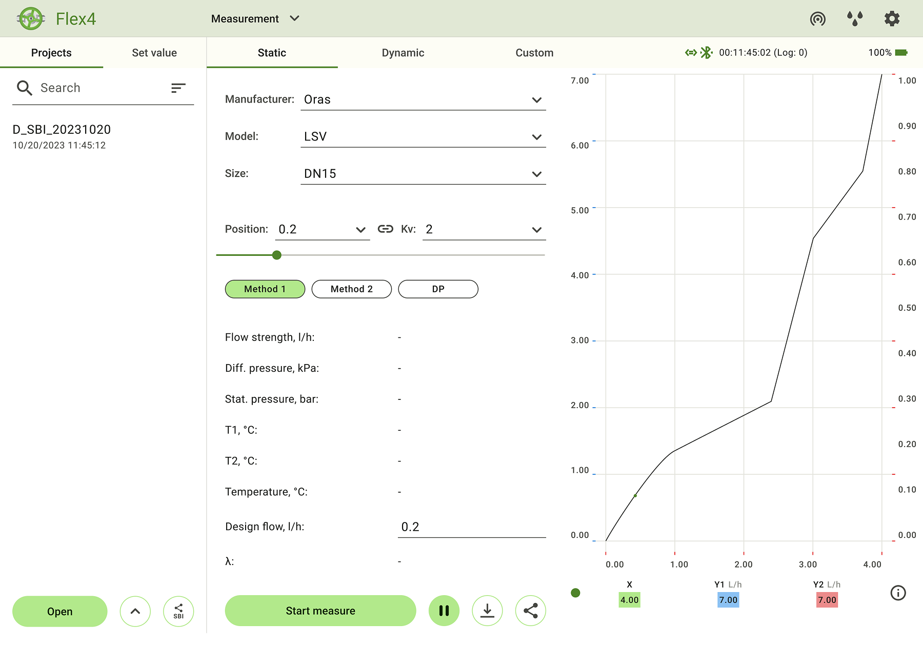
The tablet version is for professional use. More information on screen, logic closer to desktop. The result was a desktop-style view adapted for tablet: with emphasis on overview, readability, and comfortable long-term use.

Information is available at once. No need to switch between settings and charts. Added classic tabs for navigation. Clearer and more familiar, no confusion with chips.
Large amounts of data are noticeably easier to read. Navigation always in view. Fewer transitions. Fewer extra actions.
Palette adapted for 15 brands. The interface automatically adjusts to the brand’s main color. Visual consistency is kept across all configurations.
Conclusions
My first iOS project: design, development, and App Store release with a marketer.

Nuclear plant monitoring — less about UI, more about understanding system state. The project involved reworking logic, 3D storage visualization, and syncing complex scenarios.

Second iOS project. A simple habit tracker without overload or extra features.