
Health Tracker & Biomarkers
A health tracker focused on analyzing the impact of vitamins and supplements on lab markers.
Trackly is my second iOS project. After the first release I already understood the process. So I made the task harder. More logic. More scenarios. More care.
The goal was simple. Make a comfortable habit tracker without overload. So the app doesn’t tire you out or demand attention every time.
Focused separately on onboarding. In the previous project it became clear: if you put it off, it will take half the time and effort.

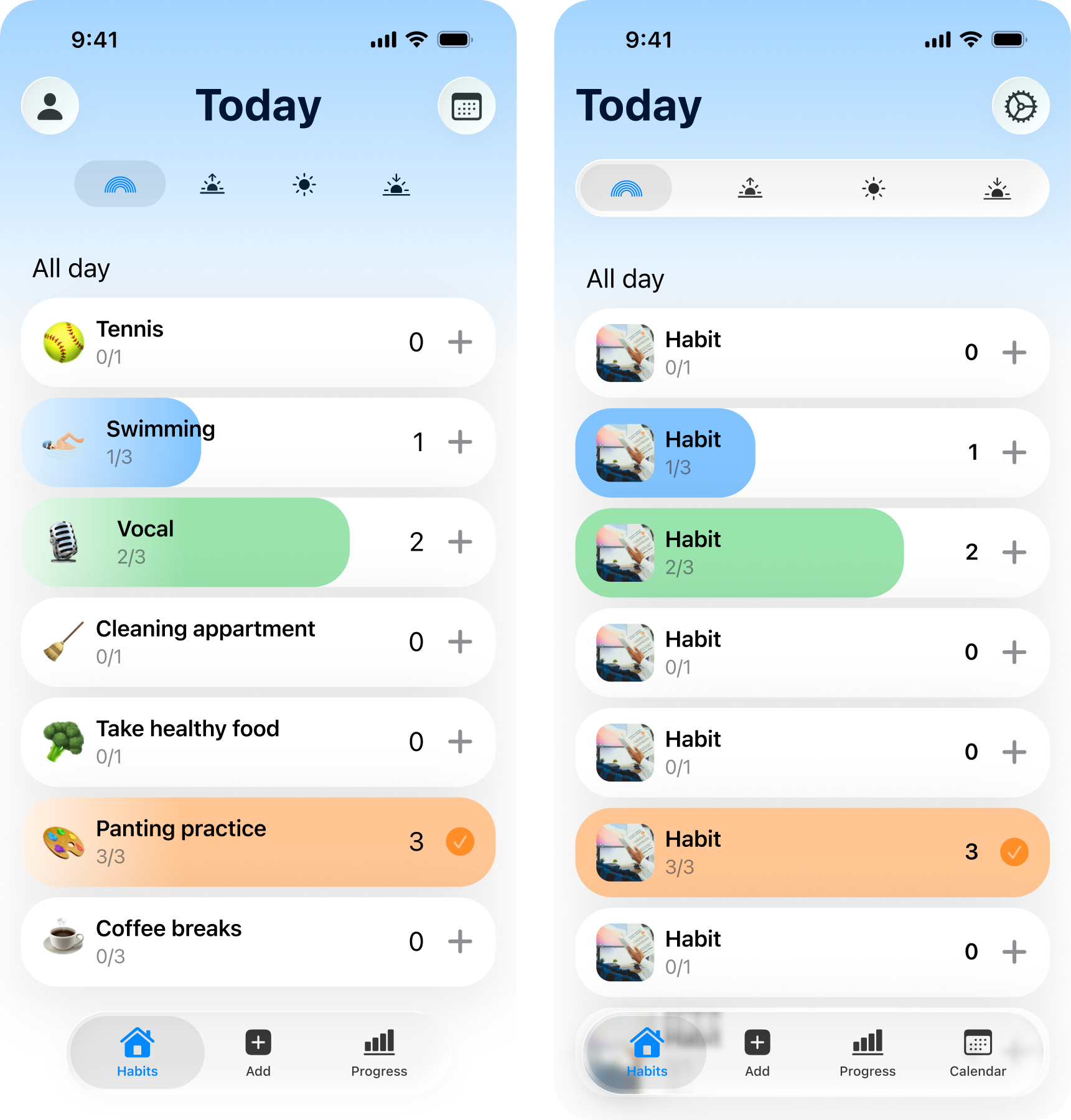
Started with the home screen. It should be calm and clear. Instead of endless charts — weekly and monthly overview. Habit details live separately. Going deeper — by choice, not by force.

I want to see habits and quickly mark completion. So I don’t keep everything in my head.
I want to add a habit in a few seconds. Pick a ready one or create my own. And start right away.
I want to see day, week, and month. To understand consistency, not rely on gut feeling.
This time I started with logic. Thought through screen states and scenarios. Only then went into design and code. Built the architecture myself, not handing everything to AI. That made Xcode noticeably calmer than in the first project.

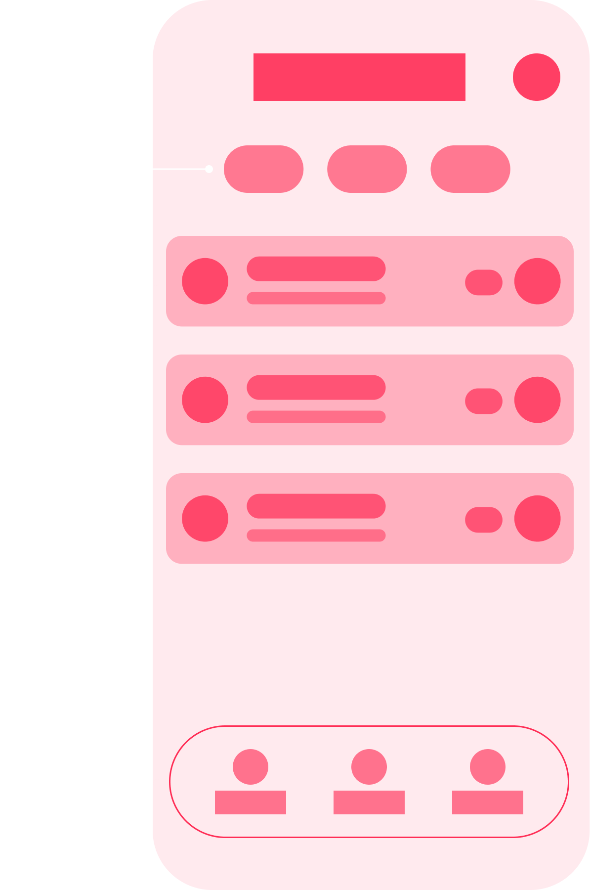
Started with basic iOS components. Wanted to see right away where standard solutions are enough and where custom is needed.
Built realistic screens and checked scenarios. Became clear what to simplify and where accents are missing.
Decided on periods and data. Added a details page and visual markers. State reads at a glance.
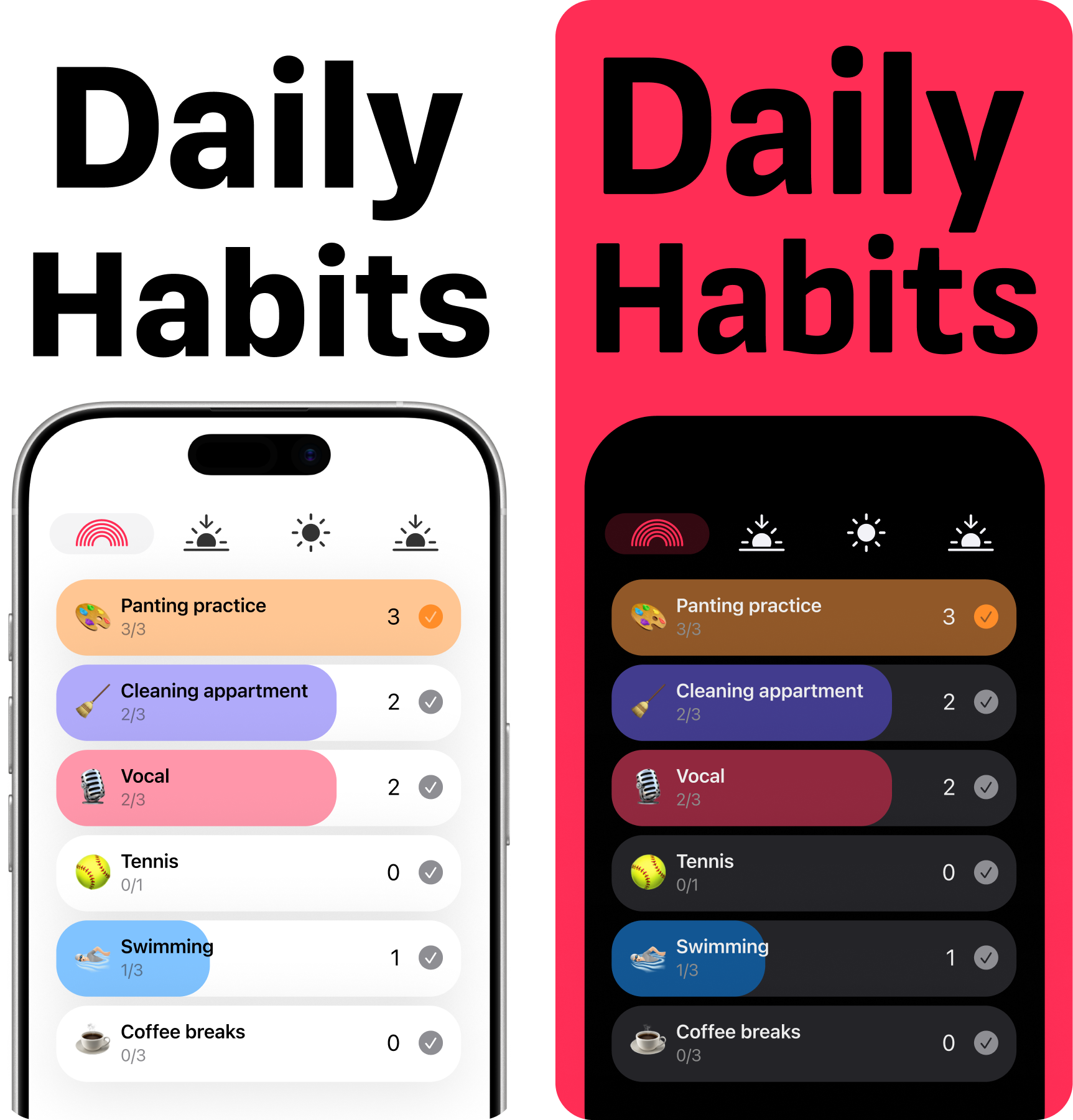
This stage went without stress. Just wanted to stand out. The App Store feed turned out very bland — pastels, same mood. I went the opposite way. Added brightness. Switched main color from blue to pink. The icon and focus on female audience played their part.

No shock from references. Calmly went through options. From too neutral to obviously unnecessary.
Blue felt cold. Green — too health-focused. Pink gave the right emotion and memorability.
Strengthened key elements. Removed clutter. Sent the build to TestFlight and checked in real use.
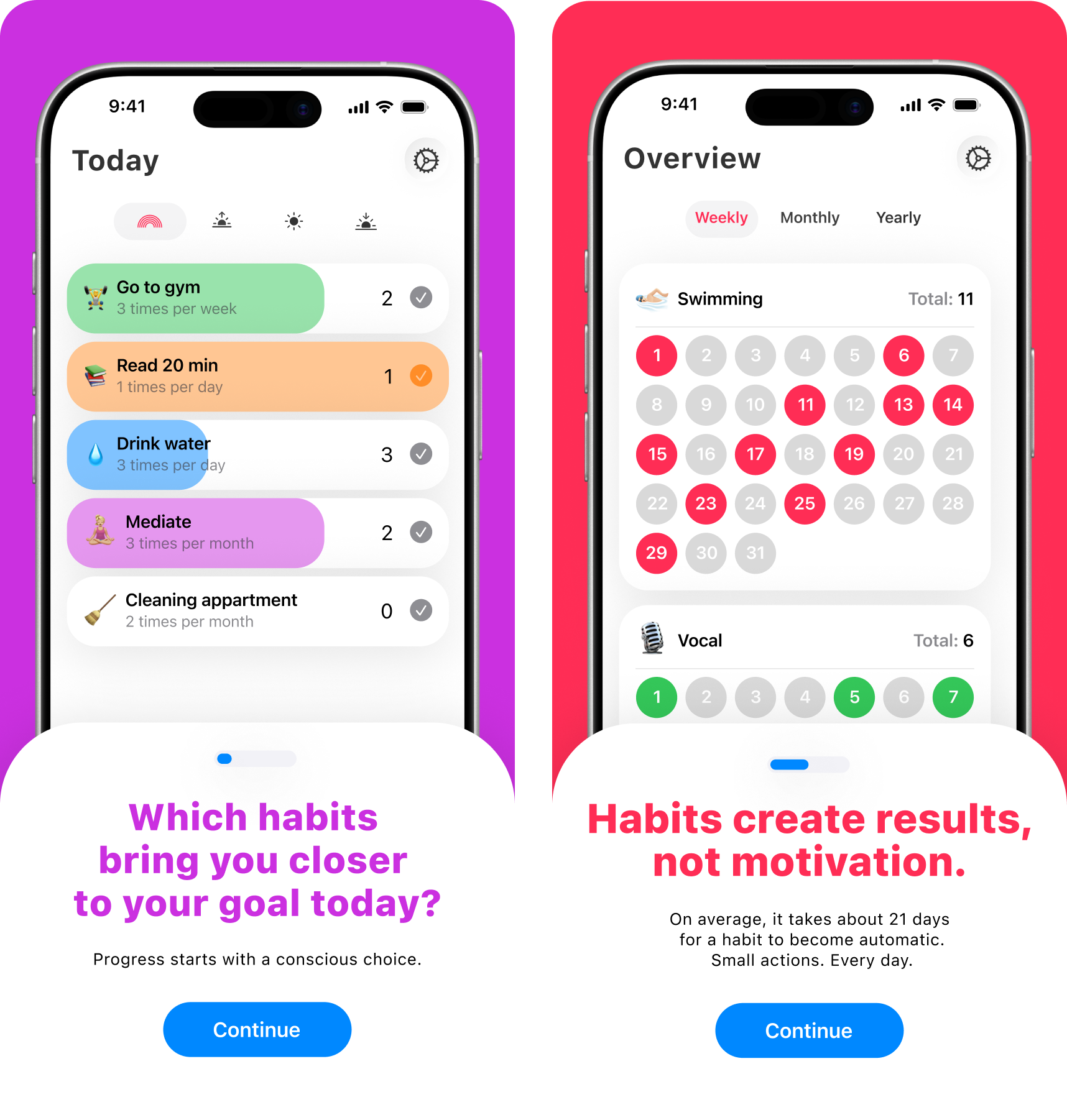
I already understood onboarding mechanics. So this time I didn’t explain the interface. Sold the value. Questions, emotion, short phrases, animations. Onboarding became part of the product, not an intro.

The marketer helped me see onboarding differently. Not as a feature list, but as a point to sell value.
Thought through where video is needed and where native solutions are enough. Ended up staying in Xcode — more reliable.
Did animations with basic Swift knowledge. Even without them onboarding works — text and structure hold it.
Conclusions
A health tracker focused on analyzing the impact of vitamins and supplements on lab markers.

Nuclear plant monitoring — less about UI, more about understanding system state. The project involved reworking logic, 3D storage visualization, and syncing complex scenarios.

Cross-platform app for monitoring and configuring engineering equipment.