
Health Tracker & Biomarkers
A health tracker focused on analyzing the impact of vitamins and supplements on lab markers.
This was one of the most complex and interesting projects. We had to improve the existing monitoring system and add new features for storage facilities. The system had been in use at BelNPP for several years, and that time had accumulated engineer feedback and real usage scenarios.
When adapting for different plants and configurations, the monitoring had to be rethought entirely. Focus shifted to clarity and reliability: the interface must help read state quickly and not overload the operator in critical moments.

In short: when an engineer opens a page, they must immediately understand equipment state. Each storage has its own configuration and set of screens. So we built a single visual language for all states and indicators — with clear notation, legends, and predictable component behavior.

First we had to integrate monitoring into the main app. Think through navigation. Define key screens and their content. It was important that the system felt part of the product, not a separate module.
The reactor diagram became the center of the interface. Cells show state and parameters. On click a detail widget opens. Special attention to notation. It must read quickly and without explanation.
Next we moved to pool elements. Designed their structure and display. Aligned grids and fonts with the real reactor. Here it wasn’t about “pretty” but accurate and recognizable.
After updating requirements I started designing the new monitoring for BelNPP. Worked closely with analysts and developers. Step by step we built logic and validated solutions against real scenarios. The project wasn’t simple. There were many technical constraints. Often had to find a compromise between usability and system capabilities. But that’s what made the monitoring clearer and more stable in use.

The main scenario lives here. The reactor and spent fuel pool got new components. Stretched the active zone and pool widgets to the max so state is visible at once. The right panel stayed static. The legend took the remaining space and is always at hand.
Next in line was the fresh fuel storage. It already existed in the system, so I fitted the new screen to current components. Tried not to break the familiar pattern and kept the display logic.
Then — spent fuel storage. The previous system didn’t have it at all. Designed from scratch. Relied on drawings and the component base so the screen fit the shared visual language.
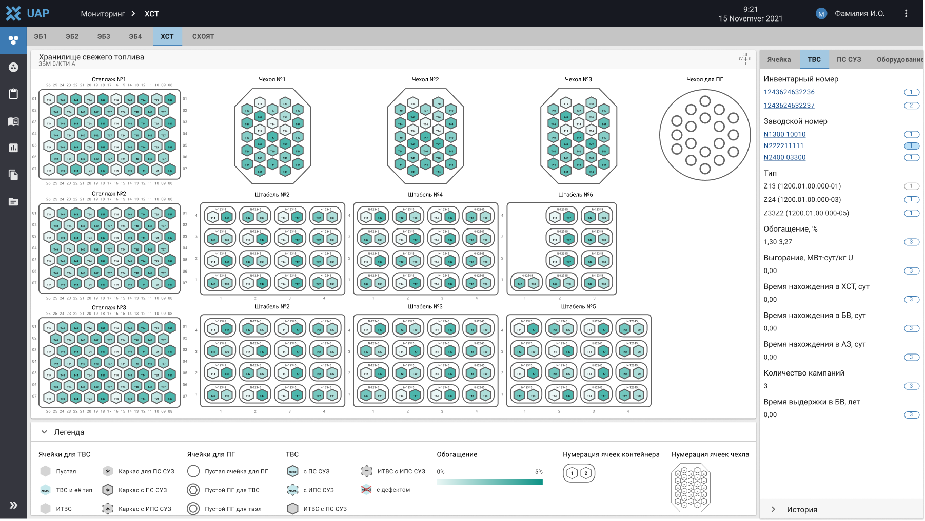
The active zone and two storage facilities were already tested and working. Next came the rest of the storage types. The task was to design them from scratch. The main complexity was 3D. It wasn’t just about showing volume, but designing clear interaction. So the engineer immediately understands where they are and what’s happening.

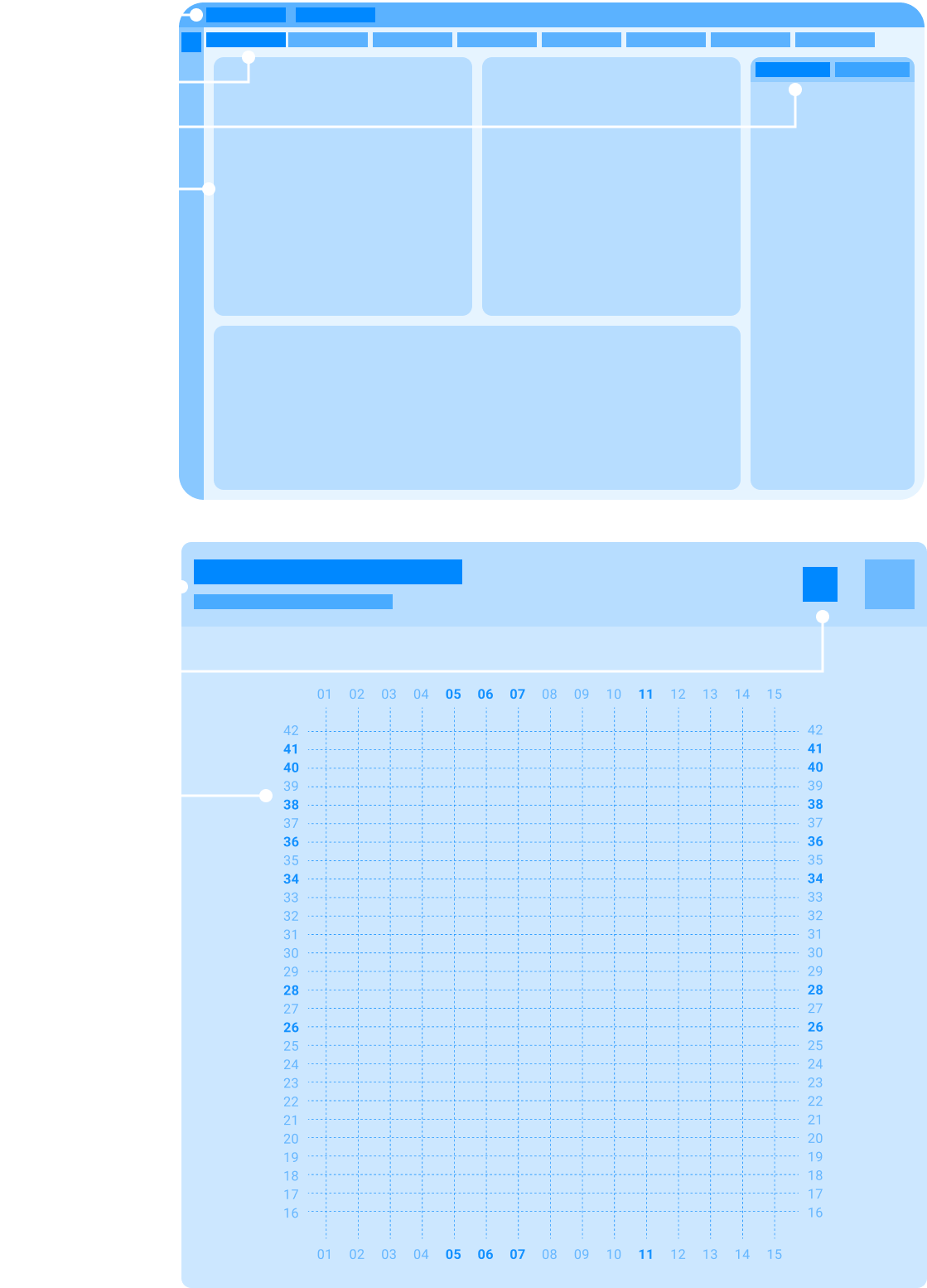
First I added levels. Now you can see at once how many barrels or containers there are by height. Assigned a color to each level. Made orientation easier.
Then a problem appeared. In some storages capsules have different heights. The top view didn’t show that. Added a side view to see real sizes.
Next step — link both views. Think through how the user switches between them. And how actions in one view reflect in the other. It was important not to lose context.
Conclusions:

A health tracker focused on analyzing the impact of vitamins and supplements on lab markers.

Second iOS project. A simple habit tracker without overload or extra features.

Cross-platform app for monitoring and configuring engineering equipment.