
Habit tracker – Trackly
Second iOS project. A simple habit tracker without overload or extra features.
Worked on the project with a marketer. Picked a popular niche. Broke down competitors. Built our own. And simplified the user journey a lot.
This was my first time being both designer and developer. So I chose a simpler task. Wanted to ship and not drown along the way.
To make the picture complete, I did everything myself. Branding. App Store assets. And onboarding with paywall.

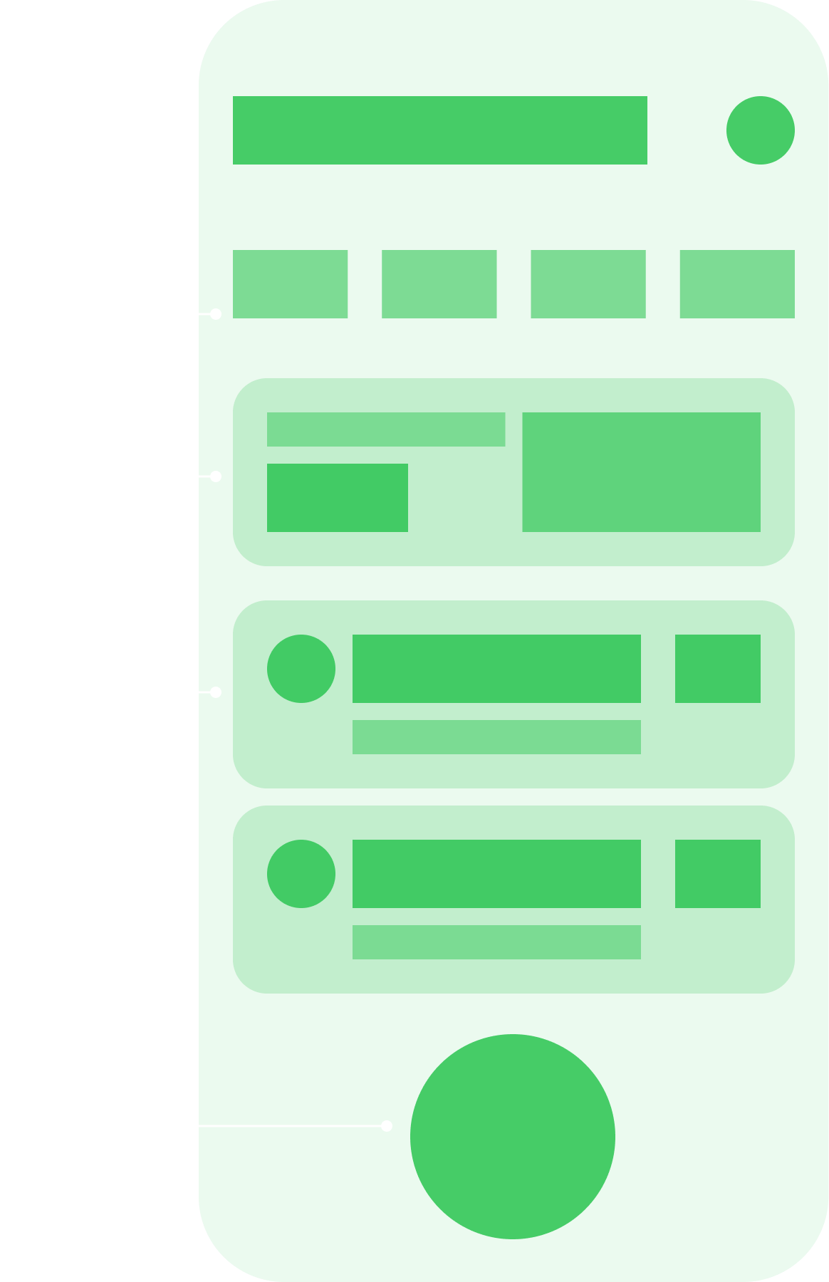
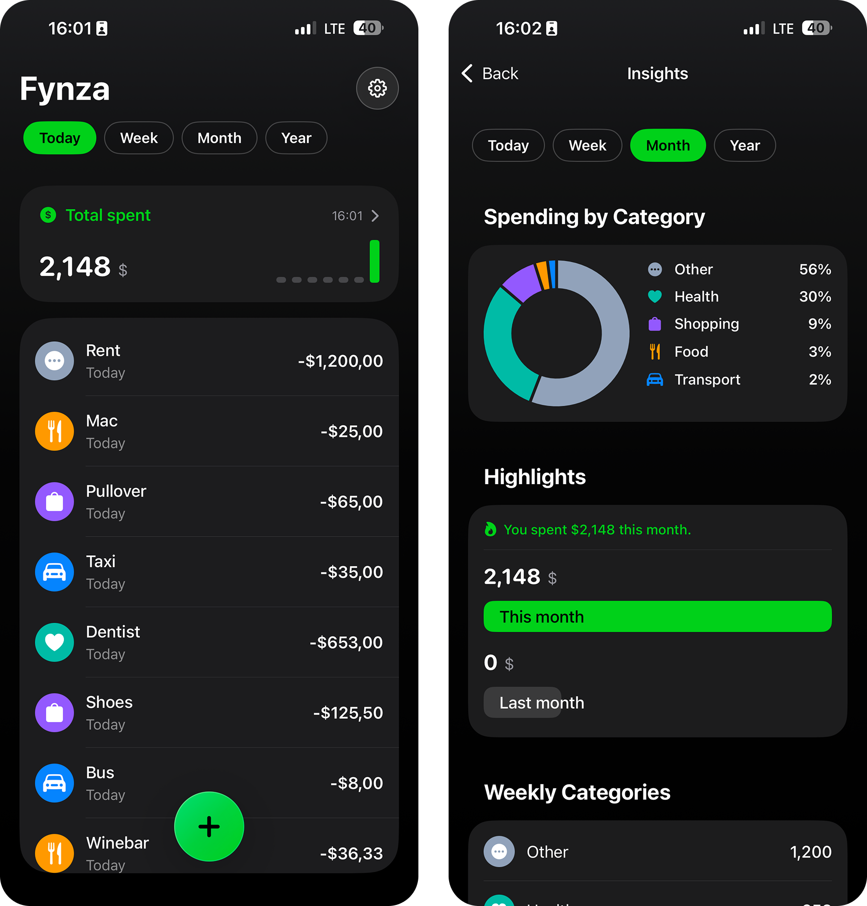
Started with the simplest scenario. Main screen — one clear entry and quick overview. Add — amount, category, and color. Analytics — optional, no overload. Settings — only what’s really needed.

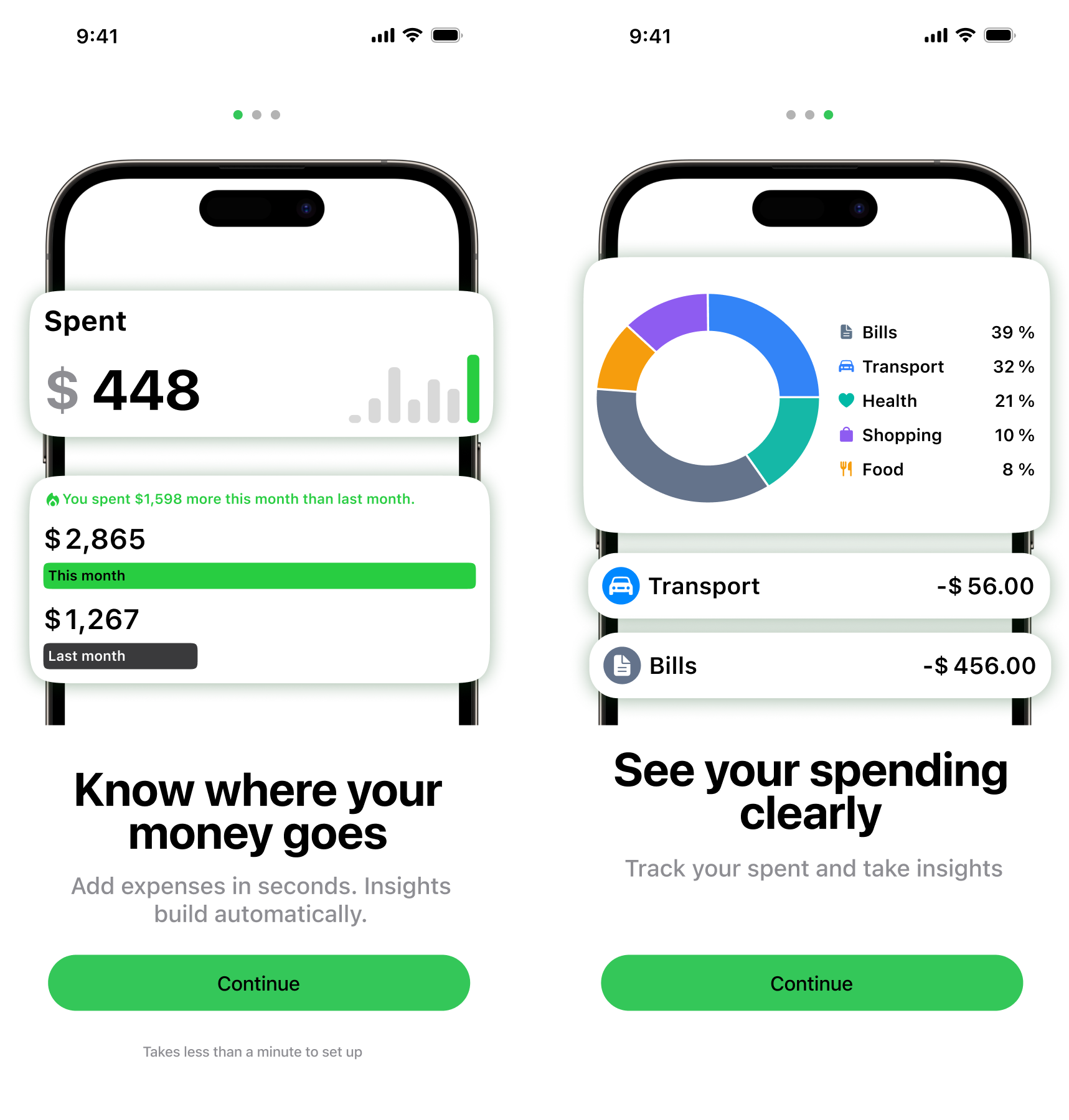
I want to quickly see spending for the period. I want to know the total. To understand how much I spend.
I want to add an expense in a few seconds. Enter amount. Pick a category or create one. So I can easily read the list and charts later.
I want to check summaries from time to time. I want to see spending structure. To understand the trend and not rely on gut feeling.
Built the shell in Xcode and laid out the structure by screens. Wrote in Swift and used Cursor for help. Quickly learned that “AI will do it all” doesn’t work. Had to get into both SwiftUI and UIKit. Then spent a long time cleaning up and fixing.

At first I trusted AI. Wanted to build fast and painlessly. Spoiler: the pain still came.
While learning, I kept changing approach. One way, then another. Ended up with something that looked like an app. But the design had to stay flexible. Lacked practice and didn’t want to box myself in.
After experiments, returned to the original idea. Laid it out by hand. By then I understood the syntax. And knew where to look and what to fix.
I underestimated this at first. Then realized a simple thing: without packaging, the app won’t be seen. Looked at competitors. How they frame the value. What screens they use. What they put in the first seconds. Discussed a lot with the marketer on how to sell it.

First shock was strong. Some references looked like scams. But that’s part of the market too.
Tried to mix aggressive patterns with my content. Felt odd. I’m used to whitespace and calm colors.
Found a compromise. Made bigger headings and stronger elements, but didn’t turn it into a banner. Toned down the background. Softened the layout with cards. Left enough room for text.
Simple idea: dollar and scanner. Did it neatly with right proportions. For light and dark theme. Looks good on the home screen.
If someone has already downloaded — don’t lose the moment. Made a short three-screen onboarding. Then — paywall. Closed the app and added first expense — paywall again. Yes, it’s a trend. And yes, it works.

To avoid suffering with themes and translations, made a universal shell. It handles any text length.
Built one shell first. Filled content from code with static data. Faster to check logic.
Onboarding came together calmly. By then I had a sense of how to do it faster and with fewer mistakes.
Conclusions
Second iOS project. A simple habit tracker without overload or extra features.

Nuclear plant monitoring — less about UI, more about understanding system state. The project involved reworking logic, 3D storage visualization, and syncing complex scenarios.

Cross-platform app for monitoring and configuring engineering equipment.